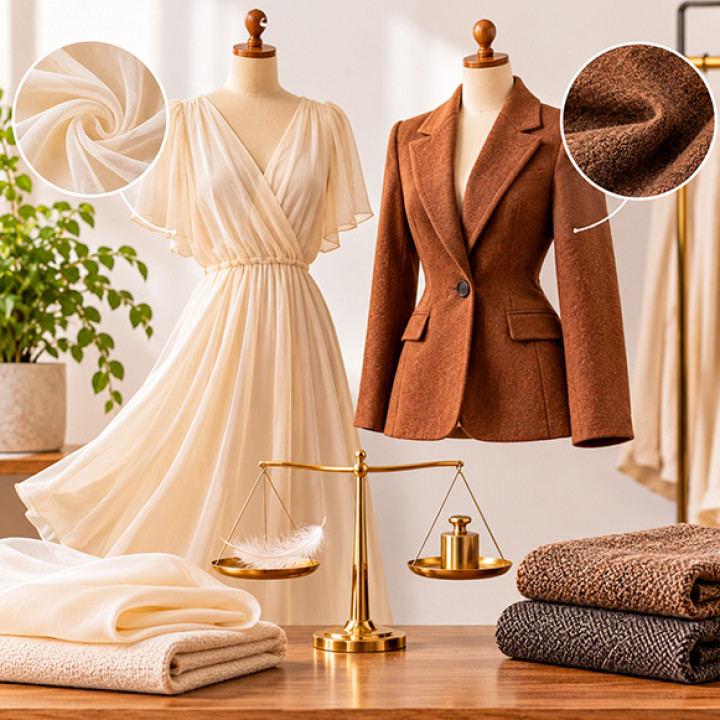

How Tonal Dressing Creates A More Refined Appearance
There is something remarkably compelling about an outfit built around a closely related colour palette. Without relying on dramatic contrasts or complicated combinations, tonal dressing creates visual continuity that can make clothing appear polished, intentional, and quietly sophisticated.
Tonal dressing involves combining different pieces that belong to the same colour family. They do not have to match perfectly. In fact, slight variations in shade, depth, saturation, and fabric surface are what give tonal outfits their character.
The appeal lies in restraint. Instead of asking different colours to compete for attention, tonal dressing allows shape, texture, proportion, and subtle colour differences to become the focus.
Understanding Tonal Dressing
Tonal dressing is sometimes confused with wearing exactly the same colour from head to toe. The concept is more flexible than that.
A tonal combination can include several shades within one colour family. A deep neutral can sit alongside a lighter variation, while a medium tone creates a visual bridge between them.
This creates cohesion without requiring every piece to look identical.
For example, different depths of beige, grey, navy, brown, or muted green can work together beautifully. The individual garments remain distinct, yet the overall combination feels connected.
Why Similar Colours Feel Refined
Colour continuity naturally creates visual flow. When there are fewer sharp breaks between garments, the eye moves more smoothly across the outfit.
This can make the overall silhouette appear more deliberate.
Tonal dressing also allows the construction of individual garments to become more noticeable. Instead of strong colour contrast becoming the dominant feature, attention can shift toward collars, sleeves, seams, fabric surfaces, and proportions.
The result is often understated rather than attention-seeking.
Contrast Does Not Have To Mean Colour
An outfit does not need dramatically different colours to create contrast. Texture can perform the same role.
Imagine combining a smooth woven fabric with a softly textured knit in closely related shades. The colours remain harmonious, while the surfaces create separation.
This is one of the most effective ways to prevent tonal dressing from becoming visually flat.
Fabric weight can contribute as well. A denser material can provide structure beside a lighter, more fluid one, creating another layer of distinction within the same colour family.
Explore Different Shades
The easiest way to begin tonal dressing is to move beyond exact matching.
Instead of searching for identical colours, explore lighter, darker, warmer, and cooler variations. These differences create depth while maintaining an overall connection.
A dark brown garment can work with a softer earthy tone. A deep grey can sit comfortably beside a lighter grey. A rich navy can be balanced with a softer blue.
The important part is maintaining enough relationship between the colours for the combination to feel intentional.
Use Neutrals As A Foundation
Neutral colour families are particularly versatile for tonal dressing because they naturally accommodate subtle variation.
Cream, beige, grey, brown, navy, charcoal, and other restrained tones can form sophisticated combinations without requiring complicated styling.
Neutrals also make texture more visible. A difference in surface becomes easier to appreciate when the colour contrast is minimal.
This creates an opportunity to build visual interest through fabric rather than relying entirely on colour.
Pay Attention To Proportion
Tonal dressing does not eliminate the importance of proportion. In fact, when colour becomes quieter, silhouette can become more noticeable.
The relationship between longer and shorter garments, fitted and relaxed shapes, or structured and fluid pieces can determine whether an outfit feels balanced.
Because tonal combinations create visual continuity, small proportion changes can have a meaningful effect on the final appearance.
This is why tonal dressing works particularly well with thoughtfully constructed garments.
Let One Shade Lead
A tonal outfit can contain several related shades without giving each one equal importance.
Choosing one dominant colour and using nearby tones around it creates a natural hierarchy. The primary shade establishes the overall mood, while lighter or darker variations provide supporting contrast.
This approach can make an outfit feel organised without appearing overly coordinated.
It also gives you greater flexibility when combining pieces from different collections or materials.
Consider Light And Surface
Colour does not appear exactly the same across every fabric. Smooth surfaces may reflect more light, while matte or textured materials can absorb it differently.
As a result, two garments with very similar colours may still appear distinct.
This is an advantage rather than a problem. These subtle differences add dimension to tonal dressing.
Paying attention to how fabrics interact with natural and artificial light can help you understand why certain combinations feel richer than others.
Tonal Dressing Across Different Styles
The technique is not limited to one aesthetic. Tonal dressing can feel relaxed, polished, contemporary, understated, or expressive depending on the garments and materials involved.
A relaxed tonal combination might use soft fabrics and gentle colour variations. A more structured interpretation can rely on sharper silhouettes and deeper shades.
The principle remains the same: maintain a visual relationship between colours while allowing shape and texture to create distinction.
Making Tonal Dressing Personal
The strongest tonal outfits are rarely created by following strict formulas. Personal preference matters.
Some people may prefer strong differences between shades, while others might enjoy combinations where the colours appear almost identical. Some may favour warm earthy tones, while others gravitate toward cooler neutrals.
Experimentation is the easiest way to discover what feels natural.
Begin with colours already present in your wardrobe. Identify several related shades and experiment with different fabrics, silhouettes, and proportions. Small changes can produce surprisingly different results.
Ultimately, tonal dressing demonstrates that refinement does not require complexity. A carefully chosen colour family can provide the foundation, while texture, proportion, fabric weight, and subtle shade variations create depth.
The result is an outfit that feels cohesive without looking overly coordinated. It allows individual garments to remain distinctive while contributing to a larger visual story.
That quiet sense of harmony is what makes tonal dressing so effective. Rather than competing for attention, every element works within the same visual language, creating an appearance that feels considered, balanced, and naturally sophisticated.